Leveraging Pareto Charts and the 5Y Method for Effective Problem Solving
For every complex problem there is an answer that is clear, simple, and wrong.
H. L. Mencken

How to Use Pareto Charts and the 5Y Method for Problem Solving for Effective Problem Solving
When it comes to tackling recurring problems in engineering or manufacturing, combining the Pareto chart with the 5Y method offers a structured and efficient approach. Here’s how these tools work together:
What is a Pareto Chart?
A Pareto chart is a visual representation of the frequency of issues or events, organized from most to least significant. The core principle is the 80/20 rule: 80% of effects come from 20% of causes.
How It Works In Manufacturing
- Monitor the problems or defects in your process.
- Chart them based on frequency or impact.
- Focus on the problems contributing to the largest share (the vital few).
Adding the 5Y Method
Once you’ve identified the high-frequency issues using a Pareto chart, apply the 5Y method:
- Ask “Why?” repeatedly (up to five times) for each issue to uncover the root cause.
- Break down each issue into sub-causes, and prioritize based on frequency or severity.
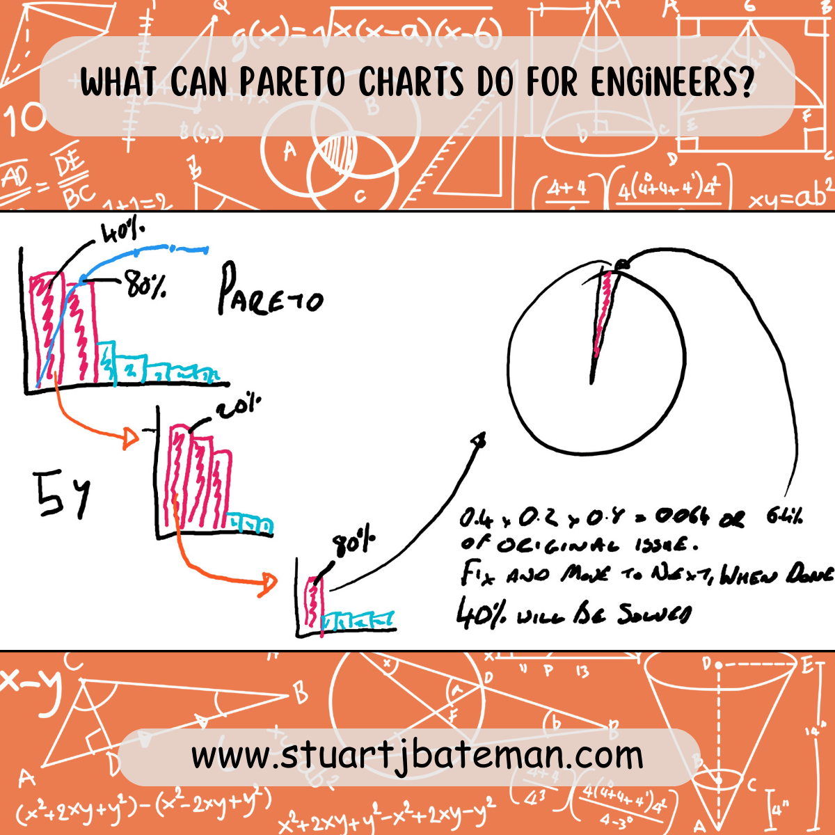
- Create a new pareto chart to monitor the next level down of causes that create the cause you’re investigating.
- Keep selecting the cause with the highest frequency until you can’t break it down further – this is the root cause for this particular aspect.
- Fix and then go back up a level to see if there was a second cause within the 80% – if so then break down, if not go up another level.
- Once you get back to the first chart you would have resolved the % the first cause contributed to the original issue.
- Select the next cause (again if it adds to the last up to 80%)
- Once they have been done, you’re left with the 20% that will take more effort (or are difficult to solve) – ask if the work so far has improved the process and met your targets, if so stop
- If not then you’re going to have to investigate and justify the next cause to eliminate, here they will only add a small fraction of a % to the process if solved.
Benefits of Combining These Tools
- Prioritisation: Pareto charts guide you to focus on issues with the greatest impact.
- Root Cause Analysis: The 5Y method digs deeper into underlying causes for effective solutions.
- Progress Visualization: Tracking resolved issues with updated Pareto charts or pie charts highlights the progress made toward reducing waste or inefficiency.
End Goal
The ultimate aim is to tackle the 80% of issues causing the most disruption and gradually work toward the remaining 20% of more complex problems.
By focusing on high-impact issues and justifying costs with clear data, these tools make problem-solving structured and measurable.
Because this tool is visual, it makes a great presentation to senior level management to help explain the impact the issue and causes have and to gain buy-in for anything you need to resolve the issue, since you’ll know how much time/cost/space you’ll get back by solving the issue you’re working on (see picture).


What are your thoughts? Have I covered everything or is there more you know and would like to share?
I’m always learning and improving this site and my blogs, so please feel free to get in touch with me via LinkedIn or this site to discuss any topics I have covered.
If you’re having trouble finding ways to progress check out these sites filled with free learning tools:


Discover more from The Chartered Engineer
Subscribe to get the latest posts sent to your email.