Spaghetti diagram, the art of untangling your processes

If you can’t describe what you are doing as a process, you don’t know what you’re doing.
— W. Edwards Deming
That quote cuts to the heart of what a spaghetti diagram does. Before you can improve a process, you have to see it — not as it should work, or as the procedure document describes it, but as it actually works. The spaghetti diagram is the fastest, cheapest, and most visually persuasive tool available for doing exactly that.
This post explains what a spaghetti diagram is, how to produce one in under an hour, how to use it to design a better layout, and what it revealed when I applied it to a real production environment.
What Is a Spaghetti Diagram?
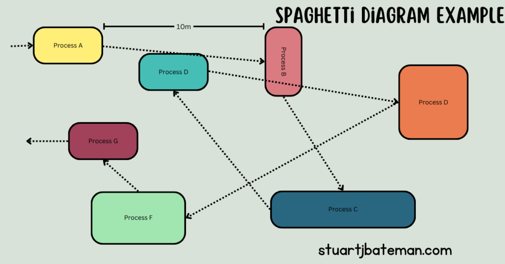
A spaghetti diagram is a lean tool used to visually map the physical movement of materials or operators through a production process. You trace the actual path taken — from stage to stage, station to station — drawing it as a single continuous line on a layout sketch.
The name comes from what the finished diagram looks like: a tangled, overlapping mess of lines that resembles a plate of spaghetti. That mess is not an accident of drawing — it is an accurate picture of the waste embedded in the process. Every crossing line, every backtrack, every loop represents movement that consumes time and effort without adding value to the product.
From a lean perspective, the spaghetti diagram is one of the first tools to reach for when approaching any process improvement. In Lean Thinking (1996), Womack and Jones establish that mapping the value stream — following the actual path of material through a process — is the essential precondition for identifying and eliminating waste. The spaghetti diagram operationalises that principle at the shop floor level: you walk the path, you draw what you see, and the waste becomes impossible to ignore.
Why It Works
The spaghetti diagram works because it makes invisible waste visible, instantly and without ambiguity.
Distance and movement are wastes that are easy to overlook when you are immersed in a process every day. A component travelling an extra ten metres between stages does not feel significant on any individual journey. Multiply that across a batch, across a shift, across a week, and the number becomes significant. Draw it on paper and show it to the people doing the work, and the number becomes undeniable.
This is also one of the most effective tools for building the case for change with operators and managers who are sceptical of improvement projects. The diagram does not require statistical analysis, specialist software, or a Six Sigma qualification to understand. Anyone can look at a tangled line drawing of their own process and see the problem immediately. That visual clarity is what makes it a powerful tool for engagement, not just analysis.
It is fast, it is inexpensive, and it generates a benchmark — a measured current state — against which any proposed improvement can be compared.
How to Create a Spaghetti Diagram
All you need to get started is a sheet of paper, a pen, and a tape measure.
Step 1 — Sketch the layout Draw a rough plan of the area showing the locations of all the stages or processes involved in producing the part or product you are studying. It does not need to be to scale at this point — what matters is the relative position of each stage.
Step 2 — Trace the material route Starting from stage 1, follow the route the material takes through the process and draw this as one continuous line, flowing from stage to stage in the sequence it actually travels. Walk the path as you draw it — do not reconstruct it from memory.
Step 3 — Measure the distances Once you have the route drawn, use a tape measure to record the distance between each stage. Note these on your diagram and add them up to give a total distance travelled per unit.
Step 4 — Calculate the time Note the average walking speed — your own pace is a reasonable approximation — and use this to convert the distances into travel time. This gives you a time benchmark alongside the distance benchmark.
Step 5 — Add the operator route As a bonus step, draw a second line following an operator through their working cycle. This often reveals a different and longer path than the material route — a source of additional waste that would not have been visible from the material trace alone.
Step 6 — Record your benchmark Add up the total distance and total travel time. This is your current state benchmark — the figure against which every future layout option will be compared.
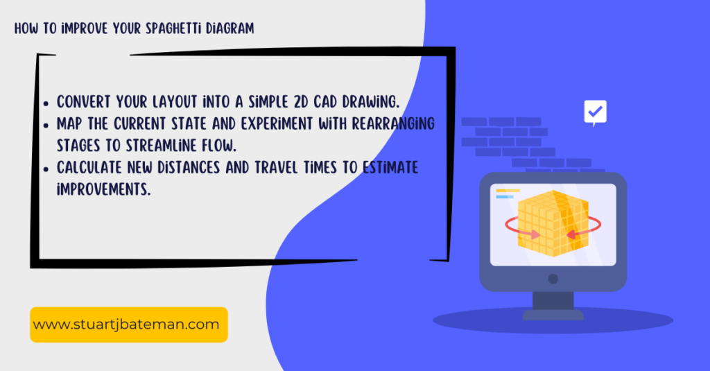
Taking It Further With CAD
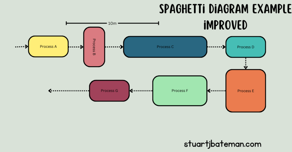
Once you have your hand-drawn benchmark, converting it into a simple 2D CAD drawing gives you a reusable tool for testing multiple layout options quickly and measuring each one accurately without redrawing from scratch.
Step 1 — Convert your sketch to CAD Recreate your hand-drawn layout as a 2D CAD drawing. Add boundaries for the walls, fixed equipment, and any immovable constraints in the space. Keep it simple — this is a planning tool, not a production drawing.
Step 2 — Redesign the layout Using the same floor area, redraw the stages in a sequence that reduces travel distance — ideally placing consecutive stages adjacent to each other and following the natural build sequence of the product. Work within the constraints of the space available.
Step 3 — Draw the new route and measure Draw the material flow line across the new layout and measure the distances. Because the drawing is roughly to scale, CAD gives you a reliable distance estimate without needing to physically set the layout up first.
Step 4 — Compare and iterate You now have a current state distance and a future state estimate. The difference is your projected saving. Iterate the layout — move stages, adjust stock locations, reconsider flow direction — until the distance and time figures are as low as the space and constraints allow.
Keep the estimates rough at this stage. The purpose is direction and magnitude, not precision. You will refine as the design develops.
Dealing With Constraints — the Monolith Problem
Not every piece of equipment can be moved. Large plant — paint lines, heat treatment ovens, pressing machines, large CNC equipment — is often fixed by infrastructure, services, or sheer scale. These are what I call monoliths: immovable constraints that the layout must be designed around rather than moved.
At Stannah, the paint line was exactly this — a monolith plant setup that could not be repositioned. The solution was not to treat it as a blocker but as a fixed point in the design. I built multiple feeder FIFO lines around it, designed to deliver parts to the paint line in the correct sequence and volume to maintain flow, without creating the pile-up that an unmanaged feed would produce. The spaghetti diagram made the approach to the paint line visible as a constraint, which shaped the entire upstream layout design.
The principle is consistent with Goldratt’s Theory of Constraints: identify the constraint, subordinate everything else to it, and optimise the flow into and out of it. A monolith is simply a physical constraint — the design response is the same.
My Experience — Accuracy International
When I arrived at Accuracy International, I was given a clean sheet of paper and a brief: understand and redesign the production process. The area I was working with was a small, crowded space — assembly, test, stores, and goods-out all operating together with no clear pattern to the layout. Some benches were positioned for safety reasons, but beyond that, the arrangement had grown organically rather than been designed.
The first thing I did was walk the process and map it.
What the spaghetti diagram revealed was striking. A single product was travelling approximately 7.6 miles through the process from start to finish. For a standard batch of ten, that meant the batch was collectively travelling 76 miles — over three weeks of production. Part retrieval alone was taking 2 to 3 hours per build, because components were stored in closed boxes stacked on top of each other with no logical organisation. That was not just inefficient — the stacking arrangement was also a manual handling risk.
Over the following six months, I redesigned the entire floor. The work was done in CAD first — testing layouts, measuring routes, comparing distances — before anything was moved. When the design was finalised, a group of volunteers gave up a weekend and physically relocated the benches and storage to the new positions.
The result: product travel distance came down from 7.6 miles to approximately 0.3 miles per unit. For a batch of ten, that is a reduction from 78 miles to 3 miles. Beyond the distance saving, the process became easier to follow for new operators, clearer for customers walking the floor, and safer — the stacked box arrangement was eliminated entirely as part of the reorganisation.
The spaghetti diagram cost nothing and took a few hours. The improvement it made possible was delivered over a weekend.
What to Do Today
The most important thing about the spaghetti diagram is that there is no reason not to start it today. You do not need software, a budget, a project sponsor, or a qualification. You need a sheet of paper and a willingness to walk the process.
Start with one product, one route, one area. Measure the distance. Calculate the travel time. Draw the diagram and put it in front of the people who work in that process every day. The conversation it generates is worth more than the diagram itself.
Then take it into CAD, explore what a reorganised layout might achieve, and use the numbers to build the case for change.
Small analysis. Measurable results. That is lean thinking at its most practical.
Key Takeaways
- A spaghetti diagram traces the physical movement of materials or operators through a process, revealing distance and time waste that is invisible from a procedure document
- All you need to start is paper, a pen, and a tape measure — no software, no budget, no specialist knowledge
- The finished diagram creates a current state benchmark: total distance and total travel time, measured and recorded
- Converting the sketch to CAD allows multiple future state layouts to be tested and measured quickly without physical rearrangement
- Fixed equipment — monoliths — is not a blocker; design the flow around it, using FIFO feeder lines or similar approaches to maintain throughput at the constraint
- The tool works because it makes waste visual and undeniable — the diagram itself is the argument for change
- At Accuracy International, mapping a single product route revealed 7.6 miles of travel per unit. A redesigned layout reduced that to 0.3 miles — a saving delivered over one weekend
Frequently Asked Questions
What is a spaghetti diagram used for in lean manufacturing? A spaghetti diagram is used to map the physical movement of materials or operators through a production process. It makes distance and travel time waste visible by tracing the actual path taken as a continuous line on a layout sketch, creating a measurable current state benchmark.
How do you make a spaghetti diagram? Sketch the process layout on paper, trace the material route as a continuous line from stage to stage, measure the distances with a tape measure, and calculate travel time. Add up the total distance and time to establish your benchmark. The full process takes less than an hour for most production areas.
What does a spaghetti diagram tell you? It tells you how far materials or operators travel through your process and where the movement is inefficient — backtracking, crossing paths, or unnecessary loops. These are all forms of waste that consume time and effort without adding value to the product.
Can a spaghetti diagram be used where equipment cannot be moved? Yes. Fixed equipment — monoliths such as paint lines or large plant — becomes a design constraint rather than a blocker. The flow is designed around the fixed point, using approaches such as FIFO feeder lines to maintain throughput at the constraint. The spaghetti diagram makes the constraint visible and helps shape the upstream and downstream layout accordingly.
How accurate does a spaghetti diagram need to be? The hand-drawn sketch does not need to be precisely to scale. The goal is a directionally accurate benchmark — the measured distances are what matter, not the quality of the drawing. When the layout moves into CAD for future state planning, accuracy improves naturally because the drawing is to scale.
References & Further Reading
- Womack, J.P. and Jones, D.T. (1996). Lean Thinking: Banish Waste and Create Wealth in Your Corporation. Simon & Schuster.
- Goldratt, E.M. and Cox, J. (1984). The Goal: A Process of Ongoing Improvement. North River Press.
Author Bio
Stuart Bateman is a Chartered Engineer with 22 years of experience across project, manufacturing, and production engineering. He writes about engineering tools, career development, and practical manufacturing techniques for engineers at every stage of their career.
Internal – Lean
Check out more Lean Manufacturing topics:
- What is Flow Production? Complete Implementation Guide 2025
- Learn what flow production is and how to implement it in manufacturing. Includes step-by-step process, real-world examples, and proven tools to increase output.
- How to create a Value Stream map
- Companies strive to reduce costs, create space and continuously imp, one way to help make this happen is by creating a Value Stream Map.
- How to…use the Theory of Constraints (TOC): Streamlining Production
- Unlock efficiency with Theory of Constraints! Learn to identify bottlenecks, optimize processes, and boost productivity for success.
- Success Story: Transforming Workflows with Continuous Improvement
- Explore a real-life success story of implementing continuous improvement activities. How the involvement of operators led to significant changes.
- How to..Conduct 3S
- Master 3S methodology (Sort, Set, Shine) with this complete lean manufacturing guide. Learn implementation steps, workplace organization, and 3S vs 5S differences from 22 years experience.


What are your thoughts? Have I covered everything or is there more you know and would like to share?
I’m always learning and improving this site and my blogs, so please feel free to get in touch with me via LinkedIn or this site to discuss any topics I have covered.
If you’re having trouble finding ways to progress check out these sites filled with free learning tools:


Discover more from The Chartered Engineer
Subscribe to get the latest posts sent to your email.
