The Power of Atomic Habits: How I Design Check Sheets That Operators Actually Use

The less reliable information you have, the more inventory you need to build – Michael Hammer
Check sheets: The ultimate tool you’ll ever use in manufacturing.
I’ve been designing check sheets for over two decades across manufacturing and production environments, and the single biggest reason they fail has nothing to do with the engineering — it’s human behaviour.
A poorly designed check sheet gets ignored within a week. A well-designed one becomes part of the shift routine and starts generating data you can actually act on. The difference, in my experience, comes down to how you design for the person filling it in — not just the data you want to collect.
A few years ago I started applying the four laws from James Clear’s Atomic Habits to my check sheet design process. It sounds unconventional, but it works — and I’ll show you exactly how I use it.
What Is a Check Sheet?
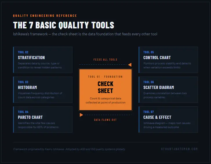
A check sheet is a structured form used to collect count data or categorical data directly at the point of production. It records the frequency of events — defects, stoppages, dimensional failures — in a format that is fast to complete and straightforward to analyse.
Check sheets are one of the 7 Basic Quality Tools, a framework developed by quality engineer Kaoru Ishikawa. The full set comprises:
- Check sheets
- Stratification
- Control charts
- Scatter diagrams
- Histograms
- Pareto charts
- Cause-and-effect (Ishikawa) diagrams
Of these, the check sheet is the data collection foundation that feeds every other tool. You cannot build a meaningful Pareto chart or control chart without reliable input data — and that data starts here.
The output from a check sheet is typically count or categorical data: pass/fail, defect type, frequency of occurrence. This feeds directly into bar charts and histograms to show how often something happens, and into control charts to show when it happens. Combined with knowledge of where in the process the data was collected, you have everything you need to start making evidence-based decisions.
Why You Need One Before You Need Anything Else
When I start a continuous improvement project, I always begin with a question and a set of assumptions about the current state of the system. What I need before anything else is data to test those assumptions — or replace them with facts.
Check sheets are the right tool at this stage because they are cheap, fast to deploy, and put data collection in the hands of the people closest to the process. In VSM (Value Stream Mapping) and in the Measure phase of DMAIC, a well-designed check sheet gives you the baseline you need to measure any improvement against.
There is also something that often gets overlooked: when operators are involved in designing and using a check sheet, they start paying attention to the process in a way they didn’t before. I’ve seen operators flag problems through check sheet data that had been invisible to engineering teams for months. That’s not a side benefit — it’s part of why you do it.
My Method: Applying Atomic Habits to Check Sheet Design
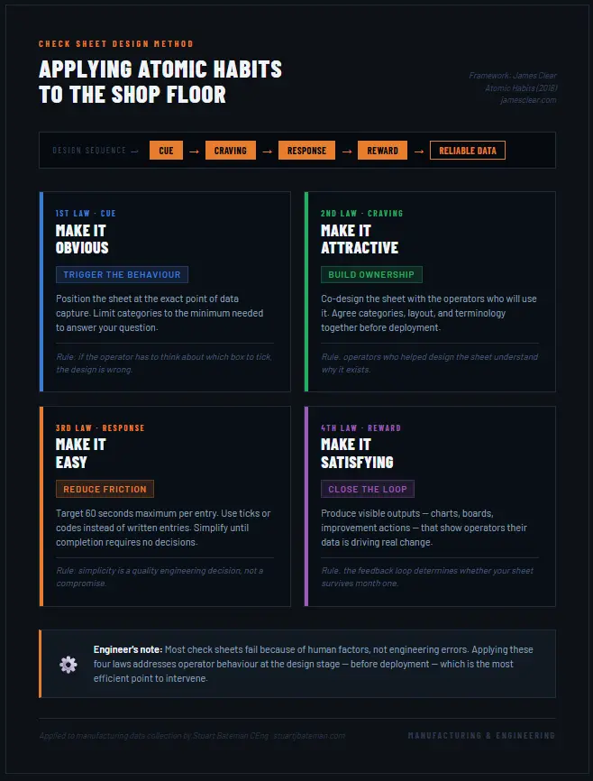
James Clear’s Atomic Habits (2018) sets out four laws of behaviour change that explain why habits form or fail. The full framework is available at jamesclear.com. When I first read it, I immediately recognised the same dynamics at play on the shop floor — and started applying them directly to how I design check sheets.
Here is how I use each law:
1st Law — Make It Obvious (Cue)
The cue is what triggers the behaviour. For a check sheet, the trigger needs to be visible, unambiguous, and positioned exactly where the data event occurs.
In practice, this means keeping the number of categories to the absolute minimum needed to answer your question. Every additional row or column adds a decision point for the operator. Fewer options means fewer errors and faster completion.
My rule: if the operator has to think about which box to tick, the design is wrong.
2nd Law — Make It Attractive (Craving)
People engage with things they feel some ownership over. Before I finalise any check sheet, I sit down with the operators who will be using it — not to present it to them, but to design it with them.
This means agreeing on the categories, the layout, the terminology they actually use on the floor, and the format. It takes longer upfront but the data quality improvement is significant. Operators who helped design the sheet understand why it exists and what it’s for.
3rd Law — Make It Easy (Response)
The response is the behaviour itself — in this case, filling in the sheet. The design goal here is to reduce friction to the lowest possible level.
My target is that completing one entry should take no more than 60 seconds. If it takes longer, I simplify. That might mean reducing categories, changing from written entries to ticks or codes, or relocating the sheet closer to the point of data capture.
A check sheet that is inconvenient to fill in will produce incomplete, inaccurate, or fabricated data. Simplicity is a quality engineering decision, not a compromise.
4th Law — Make It Satisfying (Reward)
This is the law most engineers skip — and it’s the one that determines whether your check sheet survives beyond the first month.
Operators need to see that their data is being used. I make a point of producing visible outputs — trend charts, summary boards, improvement actions — and sharing them with the team. When an operator sees a change made on the basis of data they collected, the feedback loop closes. They understand that what they record matters, and engagement improves accordingly.
This isn’t soft management — it’s how you build a sustainable data collection process.
Pros and Cons — What to Expect Before You Start
I’d rather you go into this with clear expectations than design a check sheet and be surprised by the challenges. Here is an honest assessment based on my experience:
| Advantage | Consideration |
| Low cost and quick to implement | Operators require briefing and training before deployment |
| Puts data collection with the people closest to the process | Requires active management to maintain data integrity over time |
| Generates count and categorical data ready for QC tool analysis | Data must be transcribed into digital format for trend analysis |
| Ideal starting point for CI projects with no baseline data | Needs periodic review to remain relevant as the process changes |
| Can be integrated with barcode scanners for semi-digital capture | Not a long-term substitute for automated data capture systems |
This list isn’t exhaustive, but it gives you a realistic picture of where to invest your time. The operator engagement and management oversight points in particular are worth taking seriously — neglecting either is the most common reason check sheet programmes stall.

Real Example: Flow Production Line — Defence Manufacturing
I used this exact method on a flow production line in a defence manufacturing environment. The line was producing 60 parts per day across a seven-hour production window — four families of parts, each with 16 variants. On paper, the line had sufficient capacity. In practice, flow was uneven and the team couldn’t consistently hit output targets.
The question I needed to answer was straightforward: how are the six big losses affecting flow — how often, where, when, and what fixes were being applied on the shop floor?
I designed the check sheet categories directly around the 6 Big Losses framework from Total Productive Maintenance (TPM). This gave the data a structure that mapped cleanly onto the loss categories operators already understood — equipment failures, setup and adjustment, idling and minor stoppages, reduced speed, process defects, and reduced yield. Operators were consulted before deployment; they gave feedback on whether the sheet was understandable, whether it used the correct terminology for their machines and shift patterns, and whether the timing intervals were practical. That feedback shaped the final layout.

The data revealed three things we hadn’t been able to see clearly before. First, flow was uneven because of a bottleneck — one process had a significantly longer cycle time than the rest, acting as a constraint on the whole line. Second, we were losing production hours to recurring breakdowns on specific machines that had no documented root cause or preventive action. Third, stock was building up at particular stations not because of capacity, but because we didn’t have enough trained operators for those machines.
The actions that followed were direct responses to what the data showed:
- The constraint became the pacemaker for the line, with a supermarket buffer positioned in front of it to guarantee 100% utilisation
- Each recurring breakdown was investigated to root cause — fixes were implemented and the resolved checks were added to daily TPM sheets to prevent recurrence
- Cycle times were analysed and rebalanced across the line; changeovers were reduced or eliminated where possible
- Operators were hired specifically for the constrained machines
- A second shift was introduced to meet demand without overloading the day shift
The check sheet did not solve these problems — but it made them visible, quantified, and impossible to argue with. That is what good data collection does.
When to Use a Check Sheet vs. Moving to Digital
Check sheets are the right starting point when:
- You have no baseline data and need to establish the current state quickly
- Budget for digital capture systems has not been approved
- You need operator engagement before committing to a larger solution
- Speed of deployment matters — a check sheet can be live within hours
Digital systems become appropriate once the check sheet has proven the case for investment — higher data volumes, near real-time analysis requirements, or multi-site deployment. Start with the check sheet. Let the data make the argument for what comes next.
Summary
Check sheets are the most accessible and most underestimated tool in the manufacturing engineer’s quality toolkit. When they fail, it’s rarely because the engineering was wrong — it’s because the human factors weren’t considered in the design.
Applying the four laws from James Clear’s Atomic Habits framework gives you a structured way to design for operator behaviour from the start. Make it obvious, make it attractive, make it easy, make it satisfying — and you’ll have a check sheet that generates reliable data and builds quality awareness on the shop floor at the same time.
Start here. Prove the data. Then invest in more sophisticated systems if the evidence supports it.
FAQ
What is the difference between a check sheet and a checklist? A checklist is a binary confirmation tool — done or not done. A check sheet is a data collection instrument used to record the frequency and type of events over time. Both are valid tools, but they serve entirely different purposes in a quality engineering context.
Which of the 7 QC Tools should I apply to check sheet data first? For manufacturing defect data, I’d start with a Pareto chart. It identifies the 20% of causes responsible for 80% of the problems, which tells you where to direct your improvement effort first.
How often should a check sheet design be reviewed? Review the design after the first two weeks of deployment, then at monthly intervals. The categories should remain relevant to the questions you are currently trying to answer — if the process or the question has changed, the sheet needs to change with it.
Can check sheets be used as evidence in an ISO 9001 quality system? Yes. Check sheets are a recognised method of documented information and monitoring and measurement evidence under ISO 9001:2015 Clause 9.1. Retain completed sheets as quality records in line with your document control procedure.
What sample size do I need before the data is meaningful? As a practical guide, aim for a minimum of 25–50 observations before drawing conclusions. For low-frequency events, extend the collection window accordingly — drawing conclusions from five data points will lead you in the wrong direction.
Related Posts
- How to Use Total Productive Maintenance (TPM)
- The 7 Basic Quality Tools: A Practical Guide for Manufacturing Engineers
- How to Run a DMAIC Project: From Problem Statement to Control Plan
- Value Stream Mapping Explained: A Step-by-Step Guide
- Pareto Analysis in Manufacturing: How to Find the Vital Few
External Resources
- ASQ — Check Sheet overview and guidance
- James Clear — Atomic Habits
Author Bio
Stuart Bateman is a Chartered Engineer with 22 years of experience across project, manufacturing, and production engineering. He writes about engineering tools, career development, and practical manufacturing techniques for engineers at every stage of their career.
Internal – Lean
Check out more Lean Manufacturing topics:
- What is Flow Production? Complete Implementation Guide 2025
- Learn what flow production is and how to implement it in manufacturing. Includes step-by-step process, real-world examples, and proven tools to increase output.
- How to create a Value Stream map
- Companies strive to reduce costs, create space and continuously imp, one way to help make this happen is by creating a Value Stream Map.
- How to…use the Theory of Constraints (TOC): Streamlining Production
- Unlock efficiency with Theory of Constraints! Learn to identify bottlenecks, optimize processes, and boost productivity for success.
- Success Story: Transforming Workflows with Continuous Improvement
- Explore a real-life success story of implementing continuous improvement activities. How the involvement of operators led to significant changes.
- How to..Conduct 3S
- Master 3S methodology (Sort, Set, Shine) with this complete lean manufacturing guide. Learn implementation steps, workplace organization, and 3S vs 5S differences from 22 years experience.


What are your thoughts? Have I covered everything or is there more you know and would like to share?
I’m always learning and improving this site and my blogs, so please feel free to get in touch with me via LinkedIn or this site to discuss any topics I have covered.
If you’re having trouble finding ways to progress check out these sites filled with free learning tools:


Discover more from The Chartered Engineer
Subscribe to get the latest posts sent to your email.
